Personal logo design
Strived to apply all my skills and knowledge to design my personal brand logo with passion and enthusiasm.

Overview
Project Timeline
Jan 2017 - May 2021
My role
UX researcher
Graphic designer
Context
I help goal-driven companies to achieve great results by delivering simple and creative solutions that result in an amazing user experience. I realized to advertise myself, I need to have my personal brand, logo, and a portfolio website.
I researched and analyzed my competitors, enhanced my skills by practicing designing logos for my clients and improving my logo on the go.
Finally, by applying my research and graphic design skills I designed a simple, easy to remember, and very unique logo that represents my professionalism.
Problem
Need for professionals
I want to lead my people, learn and teach how to provide professional design services. I wanted to give a start to my dream with my own branding. My logo must reflect my dream and must be crafted professionally.
Difficulty of advertisement
I want to shout out that I’m a UX designer with a big set of skills. But without my own branding, it is very hard to do. So the very beginning step of the big journey is to design my own logo by using UX methods in the process.
Constraints
Limited spared time
I had a full-time job when I was working on the project. I could only spare a couple of hours a day and I had to use it wisely.
Constantly learning
I always try to learn new things so I take courses on UX. I had to manage my free time very carefully to be able to finish my logo.
Unexpected delays
When I changed my workplace, when I had tight deadlines at work, I had to postpone the project several times.
I defined my target audience
Jonathan
UX manager | United States
Jonathan manages a design team of 12 designers and he is thinking about hiring a new UX designer for the new product they are launching. He received a shortlist of 5 to 10 UX designers. He usually spends around 30 seconds on each case study of a candidate. If he finds a case study interesting, then he spends about 15 minutes reading the details.
Goals & Needs
Wants to hire a creative UX designer with great problem-solving skills.
Needs to know how decisions were made and based on what criteria.
Wants to see the results of the work and its impact on the business.
Emotions
Frustrated to see the lack of attention to case studies.
Upset because he sees final work more than the design process.
Juliana
HR manager | United Arab Emirates
Juliana has been an HR manager for 3 years now. She usually quickly scans candidates’ CVs and checks their portfolios. If she finds a matching candidate she adds them to her shortlist. She gets upset when links to the portfolio are broken. Sometimes she gets frustrated when she cannot find the information she needs in CVs or portfolios.
Goals & Needs
Needs to shortlist from 40-50 candidates for the UX managers.
Wants to see well-crafted and appealing portfolios.
Needs to make sure the candidates match the position requirements.
Emotions
Frustrated because of broken links to candidates’ portfolios.
Sad because of the complex and hard-to-read layout of CVs and portfolios.
Process
Research
I ran competitor analyses to see how others designed their logo.
Brainstorm
I brainstormed to come up with the best logo for my brand.
Design
I designed several options and chose the best option.
Test
I tested the logo with the professionals around me.
Research
Competitor analysis.
I checked around 75 designers’ website and their logos to identify which logotype those designers are using. I tried to categorize them according to their types:

The pie chart shows that word mark and letter mark logos are the most popular logotypes among designers. I saw many designers just use their full names as their logo.
Brainstorm
Simple & creative
My logo should be very simple and creative to reflect my personality. Also, it should be scalable to many sizes.
Visually balanced
The logo should be visually balanced. I can’t use my full name as a logo, because it contains 19 letters.
Easy to remember
It should be easy to remember. I wanted to make it so simple that people could easily remember it from the first look.
Unique
My logo must be unique. Just following the trend and copying other designers, will not help me stand out.
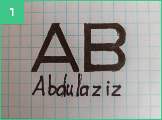
Design: Sketches
I started thinking about how I could design my logo. In the beginning, I used simple A and B letters to come up with some good ideas. #2 was a suggestion given by a senior graphic designer and I liked the idea initially.
Later I discovered very good logos where negative space is used in a very clever way. It was very appealing to me, so I tried my own version of negative space logos.
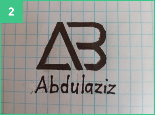

I liked option #3 a lot so I decided to go with it and improve it further to see what it could turn in to be.
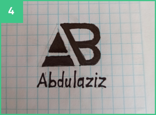
Design: Concept
I tried to design the final look with the help of fonts. I chose Helvetica as it provided a natural look of the letters A and B.

The look I got was not the one I was hoping for. So I kept refining the logo until I got the perfect look.


Design: Test
I wanted to make sure that the logo I choose was clear and understandable to people. So I tried different variations of the AB logo and tried to get feedback.


Feedback from professionals
I did an expert review with my UX and Marketing managers. In addition, I also tried to get feedback from senior graphic and UX designers. Professionals selected #1 as the best option.
Feedback from friends
I wanted to get more feedback so I showed the logo to my colleagues, family members, and friends as well. Again option #1 received the most votes.
I was more than happy with the logo now. So after I was done with the best shape I could get, I concentrated on the color.
Design: Color
My brand represents simplicity, boldness, trust, inspiration, optimism, and high quality. Blue was the best option that the most closely represents my brand besides, it is also my personal color.
Based on my brand purpose and personality, I selected two colors, Cerulean blue, and Sunglow yellow.
Below are the looks of the logo with the selected colors:
Cerulean blue
Trust, dependability,
reliable, responsible.
Sunglow yellow
Joy, happiness, optimism, inspiration.

I ran another session of expert review with a senior graphic designer. I was suggested to try Royal blue which is brighter and sharper than Cerulean blue.
Royal blue came out to look a lot better than the old blue I had chosen.
Cerulean blue
Royal blue

Design: Accessibility
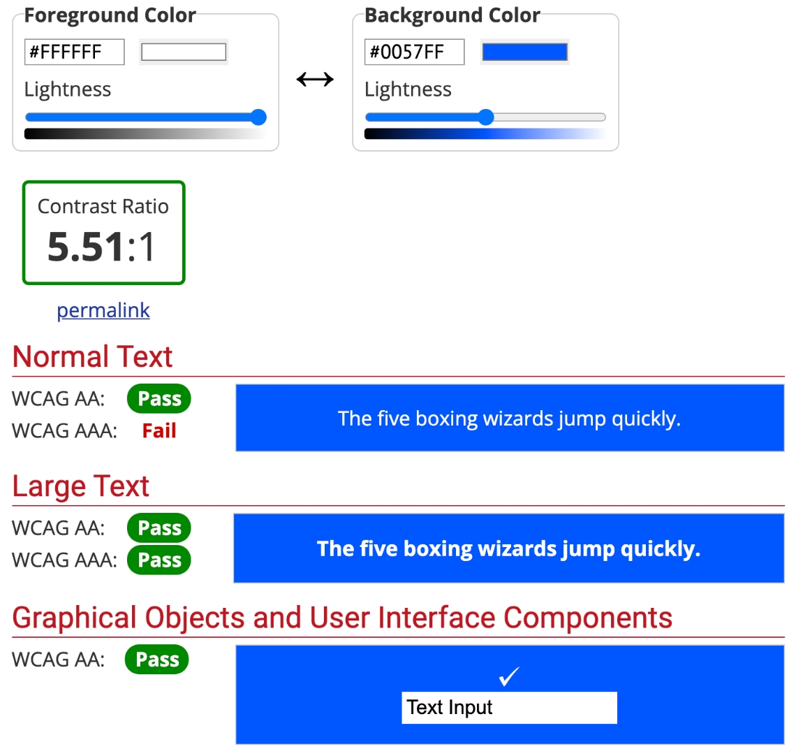
I wanted to be sure about my logo’s contrast and accessibility.
For the contrast test, I visited www.webaim.org. I tested the blue logo on a white background and vice versa. In both scenarios my logo passed the test with good results:
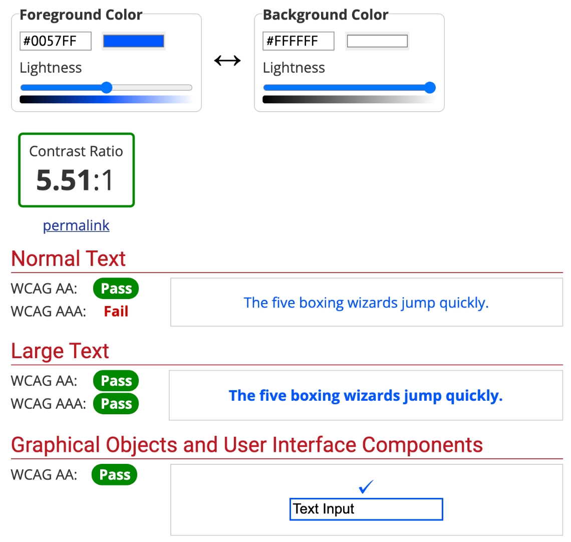
For the accessibility test, I used an Adobe XD plugin called Stark. Fortunately, the logo did not have issues here as well:
Original


Protanopia - red blind
Protanomaly - red weak


Deuteranopia - green blind
Deuteranomaly - green weak


Tritanopia - blue blind
Tritanomaly - blue weak


Achromatopsia - all color blind
Achromatomaly - all color weak


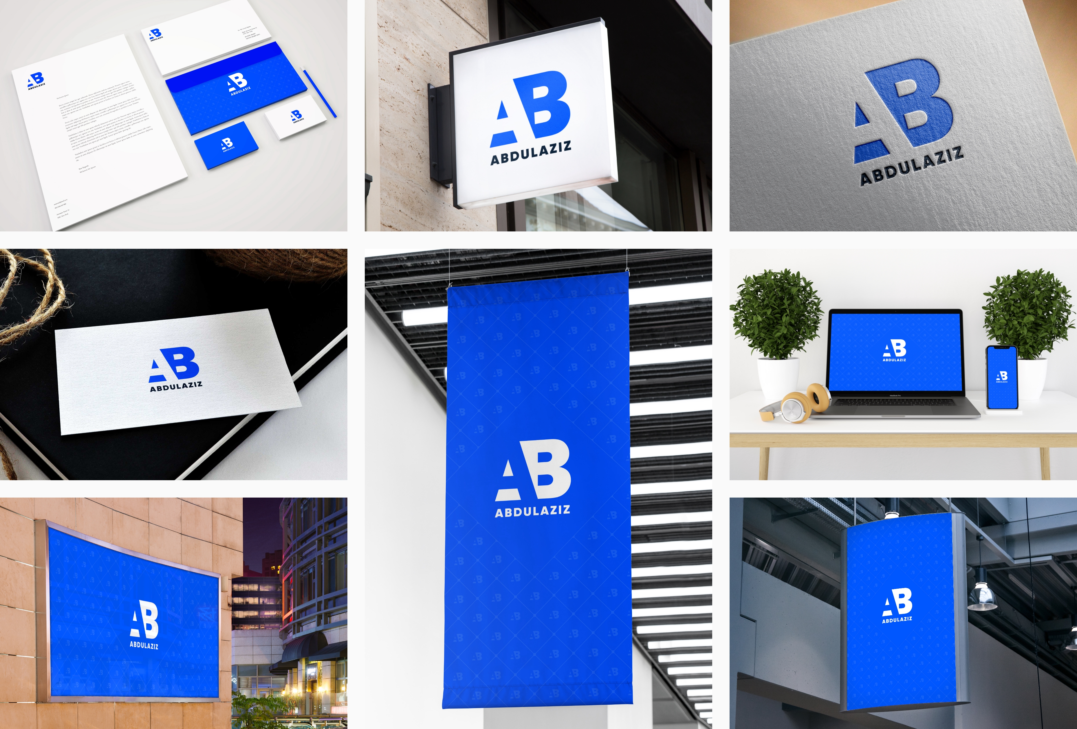
The final look
The benefits of this experience:
Social media activity
I started actively posting on Linkedin, Telegram, and Facebook. I run a channel and a UX community on Telegram. Soon I will start running my youtube channel.
Confidence to start marketing
Now I’m confident to start my own business and marketing on Instagram. I have huge plans for my brand and finally, the first steps are taken.
Opportunity to practice UX
I tried to look at branding from a UX perspective. I tried to use as many research methods as possible to practice things I learned from courses.
UX dairy
I started documenting everything I do for my career. I have a diary now and I call UX dairy. I’m trying to document as much as I can. I will need it in the future.
Organize work
I improved my time management skills a lot. I have a to-do list now and I try to stick to it as much as I can. It helps me prioritize tasks and efficiently spread out my time across different projects in my daily routine.
Areas to grow
Before I used to state that I did not like graphic design. But I changed my mind because during this project, I discovered a lot of very good graphic designers and I was inspired a lot. Now, when I have free time, I want to invest it into branding and brand strategy.
Other Projects
Jowi Owner app design
Designed an app that helps restaurant owners manage their businesses in a very efficient way.
CASE STUDYLogo design projects
Branding is my passion and it is my sidegig thing. Over the years I have designed a series of logos for companies from different parts of the world.
CASE STUDY