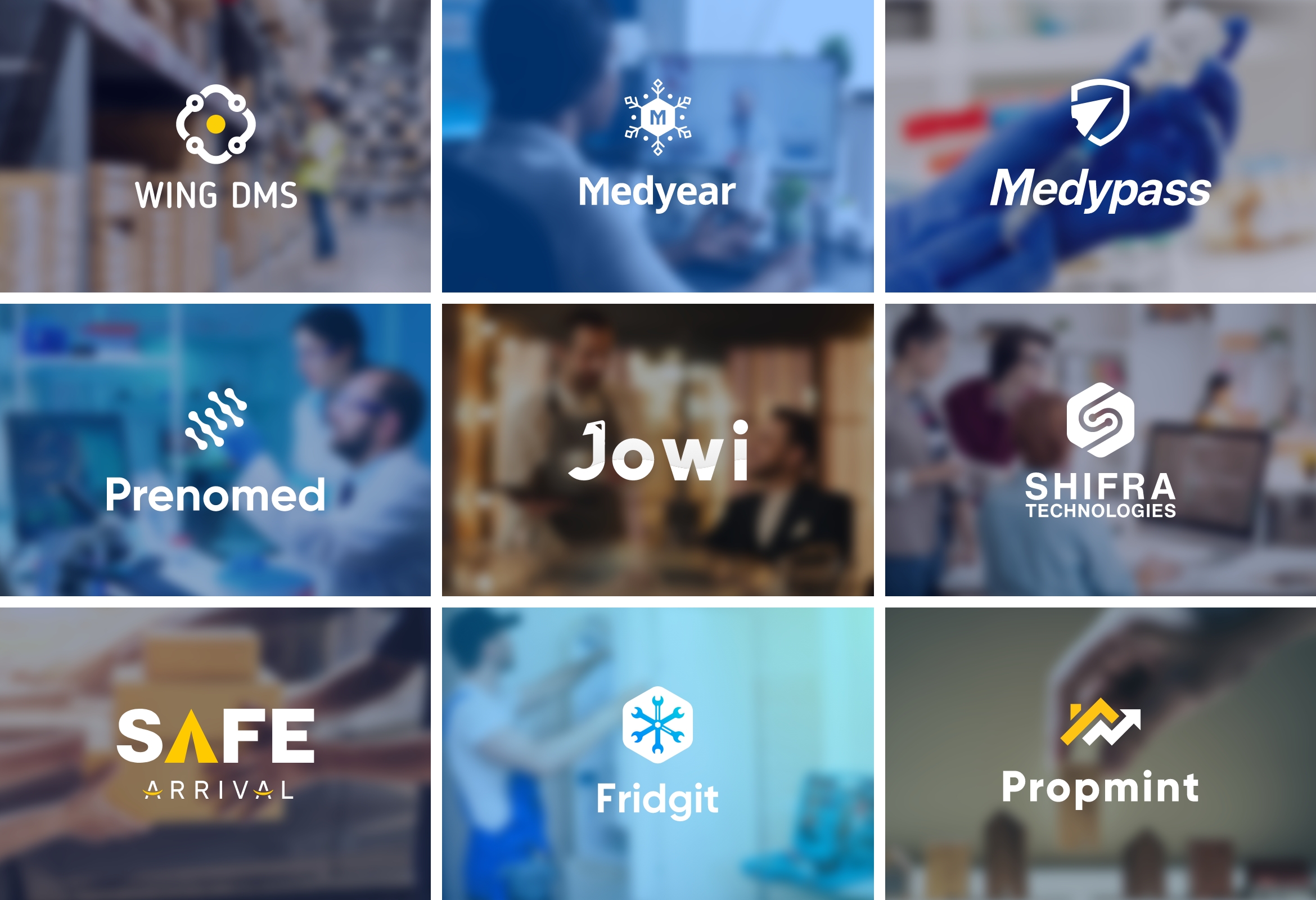
Logo design projects
Branding is my passion and it is my side-gig thing. Over the years I have designed a series of logos for companies from different parts of the world.
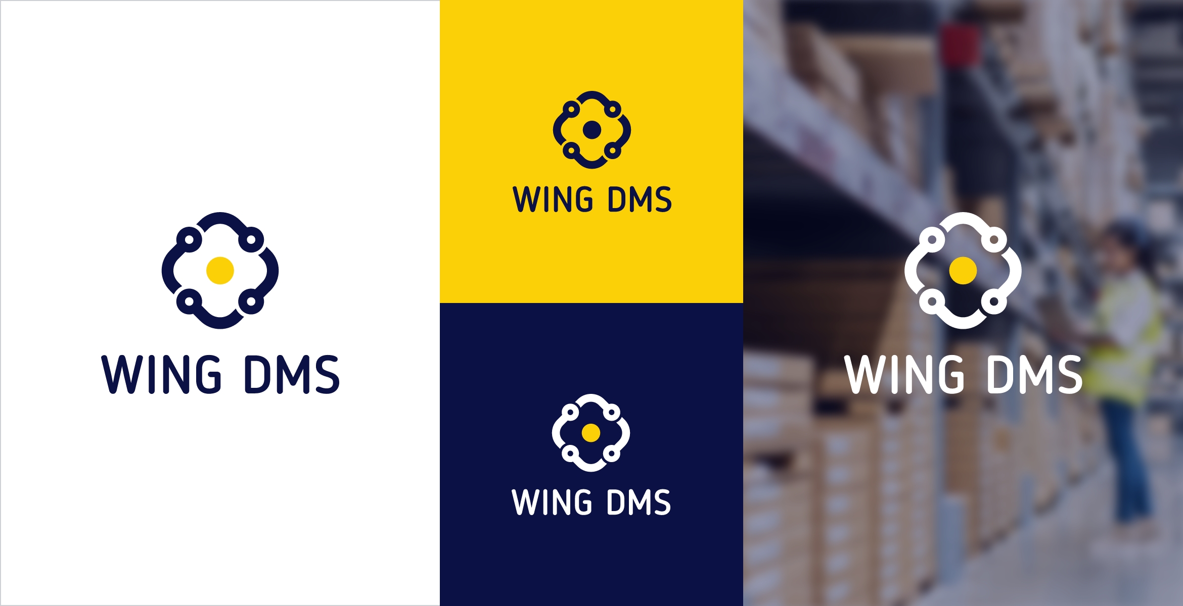
WING DMS
WING was a courier company changed owned by Amazon. In 2019 and it started selling its system to other couriers companies on subscription-based. We decided that the new business model will run under a separate brand called WING DMS. I was tasked to design a logo for the company. The logo should represent the followings:
Delivery service of any type
Service provided Worldwide
Technology
Connection to WING
It was hard to join everything into one logo, but I could manage to design this option that could provide everything listed above.

The turning line with a circle at the end represents a path with a destination that indicates on delivery service.

By adding negative space to the circle, I made the line look like a wire that is widely used to represent technology.

I tilted the square 45 degrees to make its 4 rounded corners look like 4 arrows that signify 4 sides of the world or worldwide.

I added the circle of the Wing logo to the center of the shape. The movement is happening around the circle which means WING runs everything.
For the colors and font, we decided that WING font Blogger sans and WING colors are the best options to show even more connections between the two brands.
Navy Blue
Hex: 0B1145
Sunlight Yellow
Hex: FCD007
White
Hex: FFFFFF
The final look
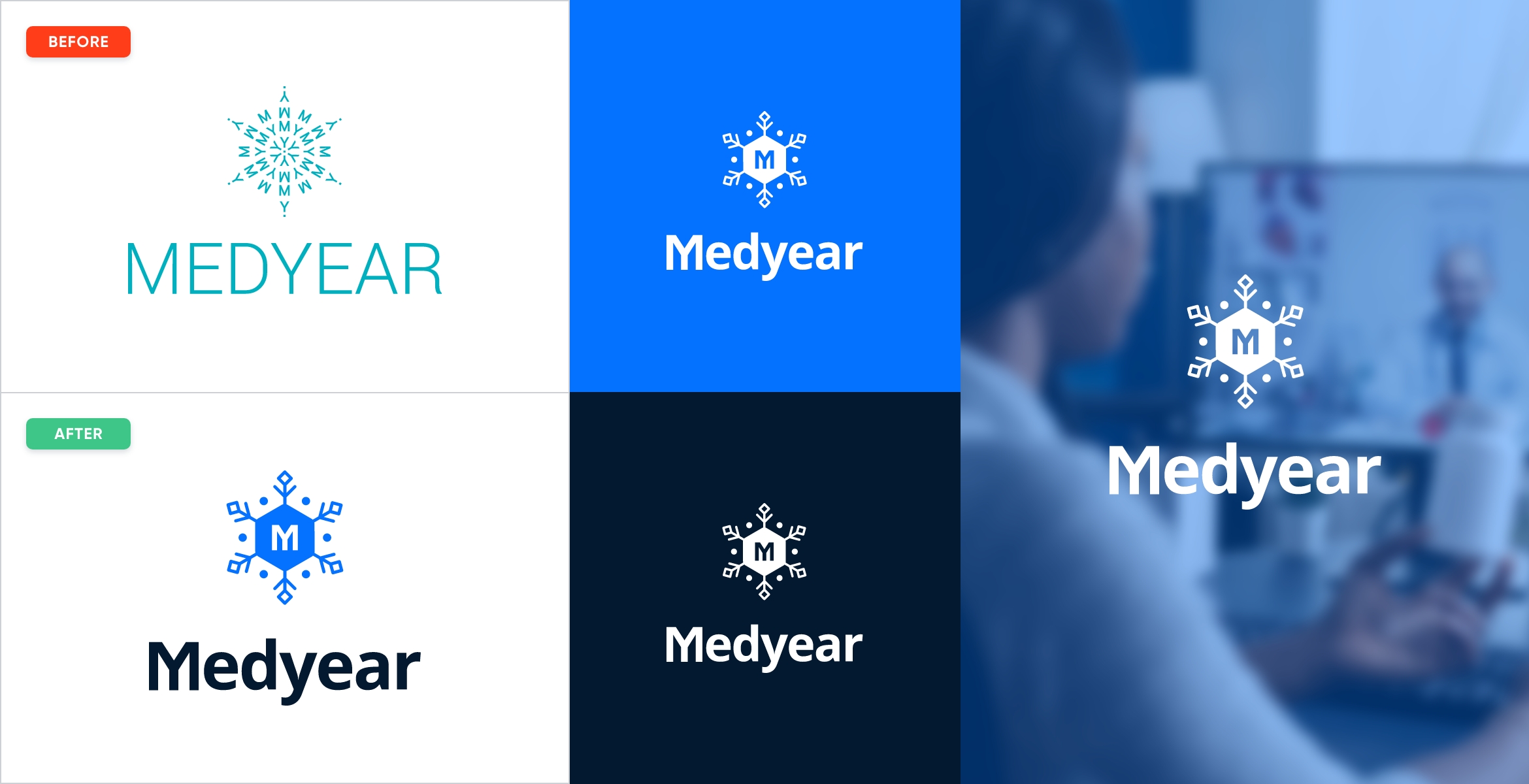
Medyear
Medyear is a healthcare technology company established in 2012. By 2019 the company logo looked outdated and the brand identity assets were not organized and designed properly.I was tasked to redesign the company logo and the assets. The founder wanted the new logo to highlight these things.
A snowflake to represent the uniqueness
Keep the letters M and Y to indicate the company name.
Medical records for a year long.
I was inspired by the old logo but I did not want to take a similar approach as the old logo had too many objects.

Medyear’s old logo consists of M and Y letters in the form of a snowflake.

I designed a snowflake that consisted of 6 sides in the form of people. It means Medyear connects all healthcare professionals with its solutions.

I joined the letters M and Y together to get the MY shape. It should add to the meaning of the new logo.

The final shape was the snowflake with the MY letters in the center.
I chose Royal Blue and Navy Blue colors as the main colors and yellow as the secondary color. Royal blue represents trust, dependability, reliability, responsibility.
Royal Blue
Hex: 0572FF
Navy Blue
Hex: 03192F
Yellow
Hex: FFC927
The final look
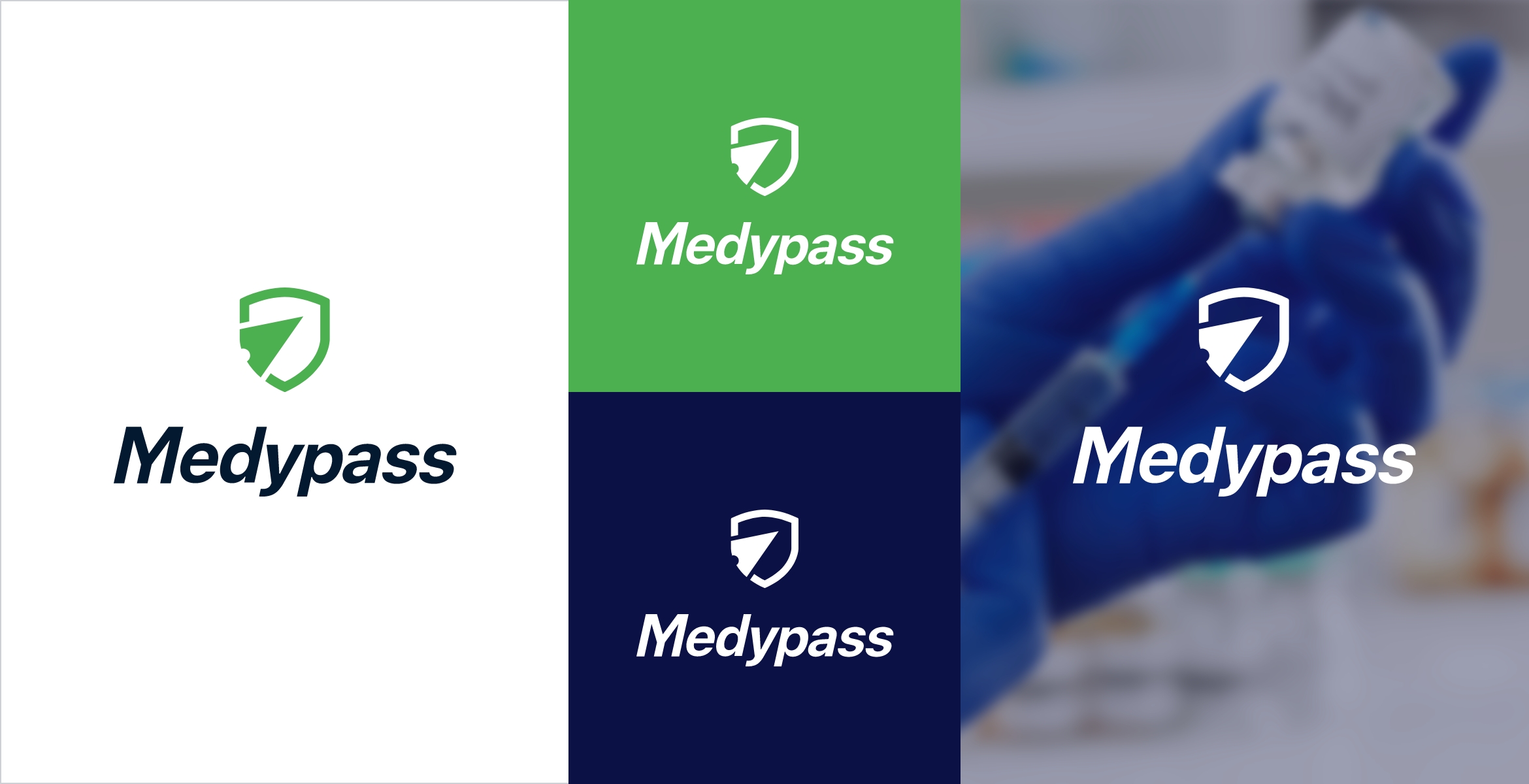
Medypass
Medypass is an app designed for storing medical records digitally (mainly for C19 and Vaccine records) obtained from various sources. The app is very useful for travel and to enter facilities where proving safety from C19 and vaccination is required.We decided to launch the app under a separate brand. I was tasked to design a logo that represents these things:
Safety in the form of a shield or something similar.
Use an arrow that signifies a pass for freedom

I used a shield to represent safety. It is a very common method so I wanted to use the existing method.

I added a compass arrow pointing up the right side that represents freedom of travel.
I chose the colors from Medyear brand guidebook. As the primary color, I decided Fruit Salad green would be perfect. As the secondary colors, Navy Blue and Yellow accompanied the green.
Fruit Salad
Hex: 4CAF50
Navy Blue
Hex: 03192F
Yellow
Hex: FFC927
The final look
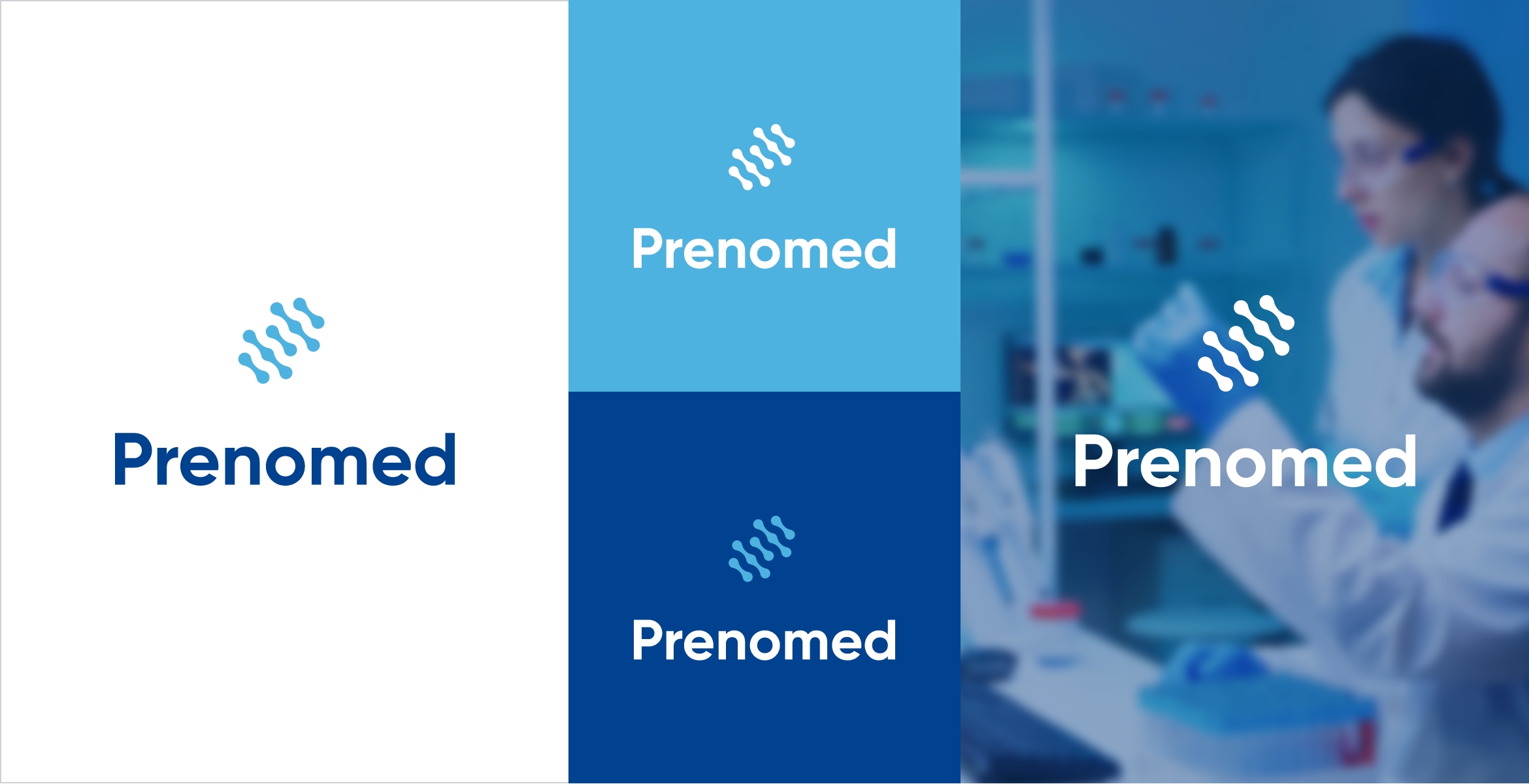
Prenomed
Pronomed is a new project by Protective Labs that concentrates on DNA testing mainly. Prenomed app is a white-labeled version of Medyear app to exchange DNA testing results and records.I was tasked to design the company logo and the assets. I was informed that these things should be the main point to consider:
The logo should indicate to Lab and DNA
The logo should also indicate to Technology
They have many other testing kits, DNA is the main target.
I researched the internet looking for ideas. It was not simple to join all the meanings into one shape.

I stacked circles into a group that reminds a double helix, the sign of DNA.

I joined the circles in each line together to form a double helix. But each line also looks like wires, the sign of technology.

I tilted the shape to the right 45 degrees, to make it look like a DNA double helix.
I was requested to use Protective Lab colors, so I did not have to work on it that much, just took the colors and applied them.
Congress Blue
Hex: 00428F
Picton Blue
Hex: 4EB2E0
White
Hex: FFFFFF
The final look
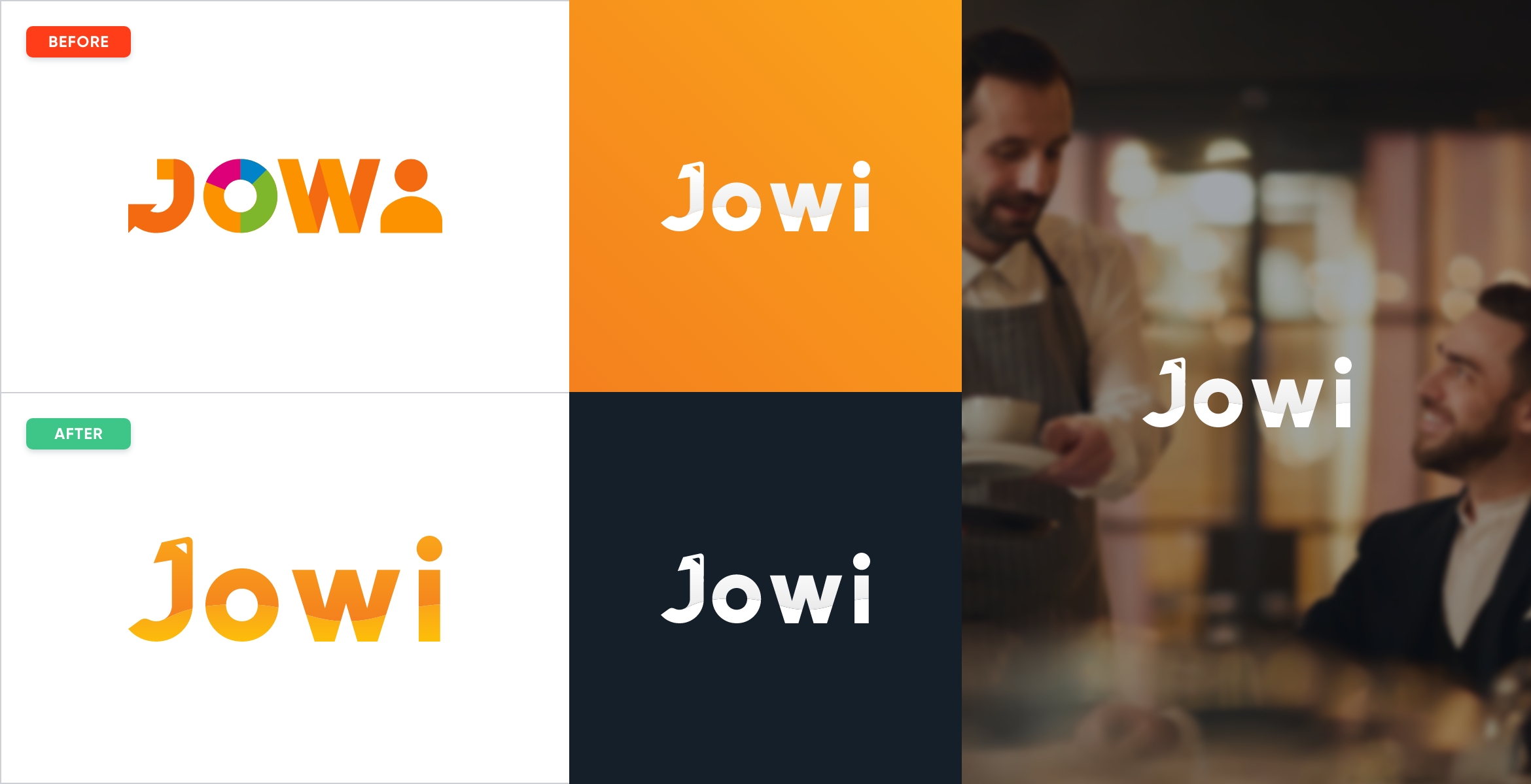
Jowi
Jowi is a restaurant management system that operates in multiple countries. They approached me asking for a logo redesign. They did not like the previous design so wanted to redesign the logo.I decided to concentrate on the “Jowi” name based on these points listed by the client:
Jowi is a restaurant management system.
Jowi will have more products in the future, approximately 8-10.
Each new product will use Jowi name, for instance, Jowi Booking.

I used the company font Gilroy to get the Jowi word. But it was not even close to what I wanted to design.

I made changes to the letter J, added the top part with an upward arrow to the letter. I changed the rounded bottom part of J.

I added a wave to the Jowi word that split it into parts. I used two gradient colors to distinguish the two parts of the Jowi word.
I was requested to use the existing colors of the brand which made my work a lot easier.
Tango
Hex: F4801E
Tree Poppy
Hex: FAA41A
Mirage
Hex: 141F29
The final look
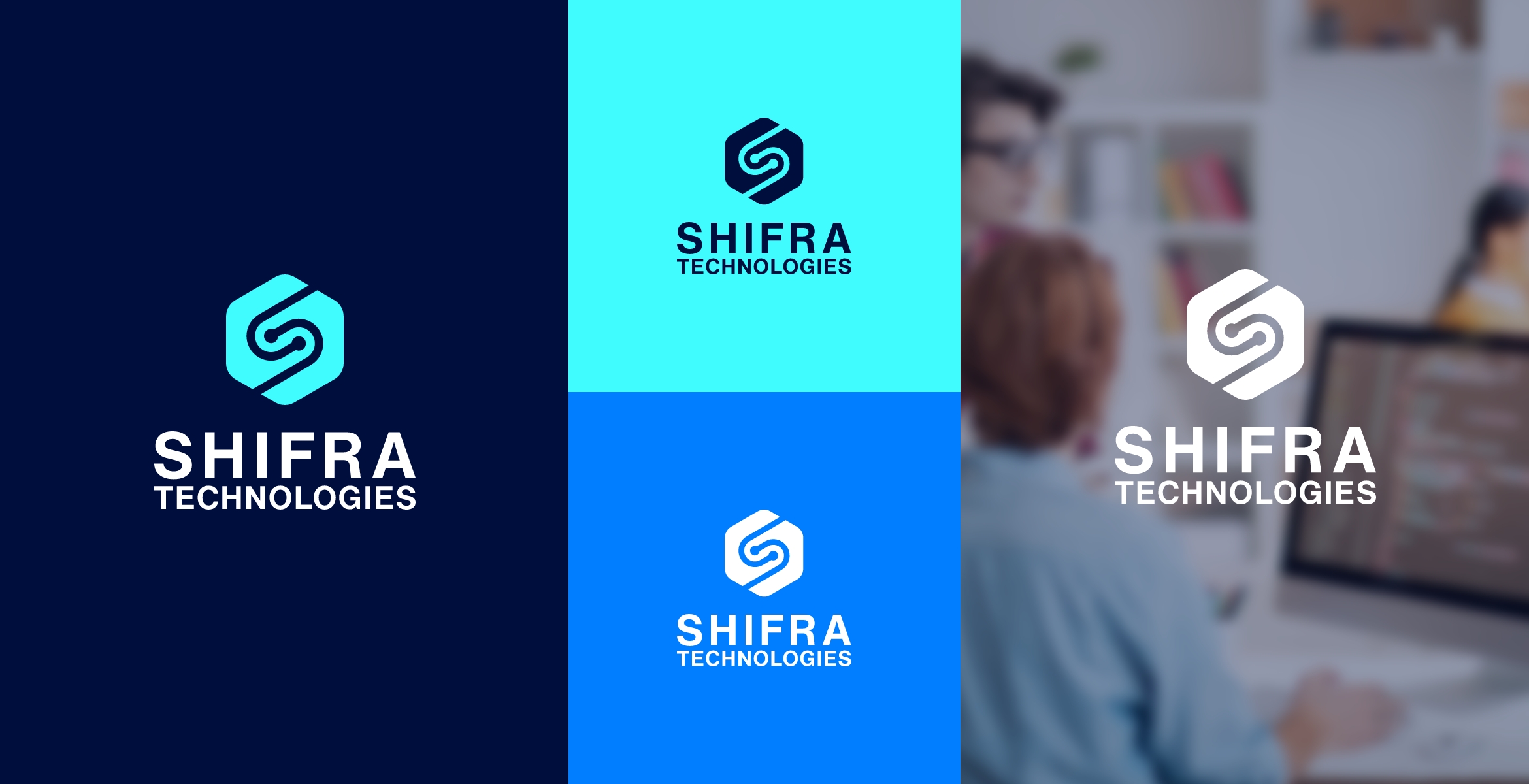
Shifra Technology
Shifra Technology is more like an IT company located in Lebanon. It is a new company and they asked me to help them design their new logo and the brand assets after that.The client shared his vision with me about the logo and it included:
The logo needs to show the S letter in it.
Make it obvious that the company is a technology company.
The company will have many different technological products so it will be logical to show that is a multi-directional company.

First, I tried to design the letter S in a different way. Using fonts would not work here so I used custom design.

I added circles to the end of each line to form two wires. Together they form the S letter, also they mean technology.

I tilted the newly formed S by 30 degrees and placed it inside a hexagon in negative space to indicate that Shifra Technology is a multi-directional company.
I chose Strator and Cyan/Aqua as the main colors, and Azure Radiance as the secondary color.
Stratos
Hex: 000E3E
Cyan / Aqua
Hex: 40FCFF
Azure Radiance
Hex: 007EFF
The final look
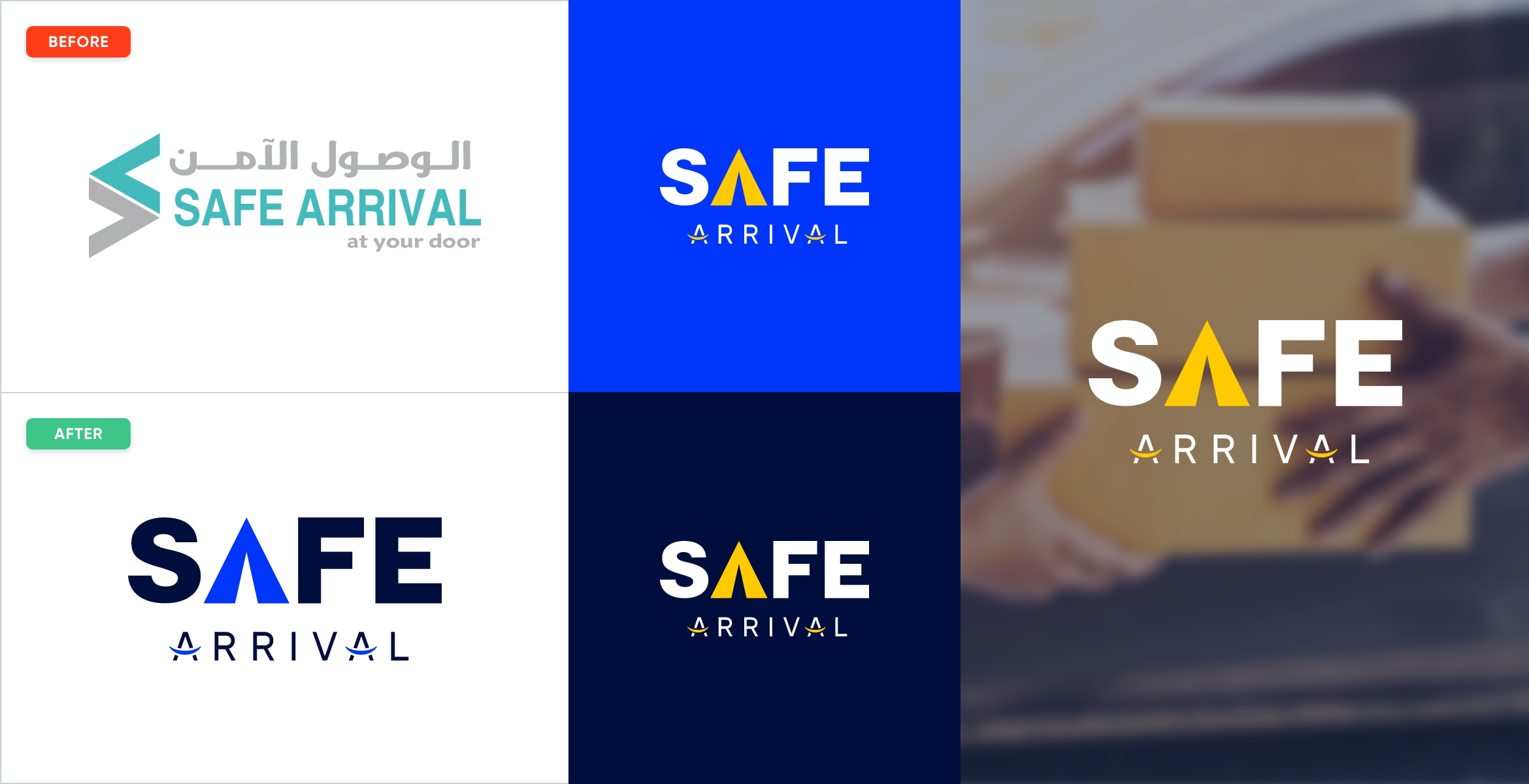
Safe Arrival
Safe Arrival is a courier company located in Saudi Arabia. In 2019, they wanted to enter the United Arab Emirates market and for that, they wanted to redesign their company logo.I redesigned their logo based on these instructions from the client:
The client wanted a wordmark logo, the name “Safe Arrival” should be the logo of the company.
The word Safe should be the main point here, as the company provides safe deliveries.
Also, it would be nice to have delivery in the meaning of the logo.
“We deliver smile” is their slogan and if possible put a sign in the logo.

I wanted to write the words so that they form the shape of squares or rectangular.

I tried to highlight the word Safe over Arrival so I decreased the size of the Arrival word and placed it below & center of Safe.

I worked on the letter A to make it more like a tent and an arrow directed to the upside. This A symbol is as an app logo.

I added two smiles to the word Arrival. When the shipment arrives, it causes a smile for the owner of the shipment.
I chose the Blue Ribbon, Supernova yellow, and Stratos as the main colors of the brand.
Blue Ribbon
Hex: 0036FB
Supernova
Hex: FFCB00
Stratos
Hex: 000E3E
The final look
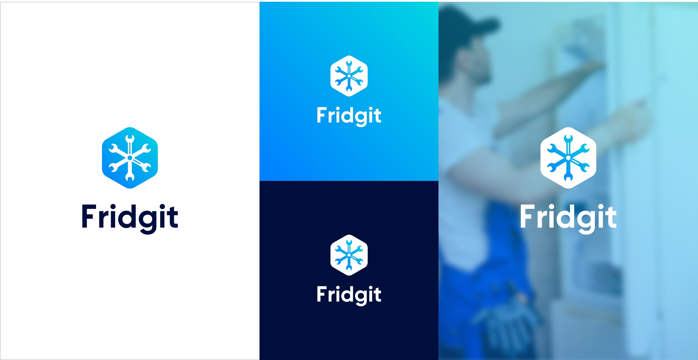
Fridgit
Fridgit is a product of Shifra Technology based in Saudi Arabia. It is a management system for fridge maintenance companies. The clients wanted to design a logo for the product.I received the following points to keep in mind while designing the logo for the product:
The logo should indicate the maintenance of fridges.
The service is done fast and the logo should have a sign for that.
The logo should have a connection to Shifra Technology.

I used a wrench to represent maintenance. Initially, I wanted to use a screwdriver, but it did not look good at the end.

I joined 3 two-sided wrenches into one to form a snowflake. Snowflake represents fridges.

I added a hint of the clock to represent fast service. I kept the hint small because did not want to ruin the logo with a big clock.

I placed the shape inside a hexagon to have a connection with Shifra Technology.
In order to have more connection with Shifra Technology, I decided to use its main colors Azure Radiance and Stratos for Fridgit. On top of that, I used Robin’s Egg Blue as one of the primary colors.
Azure Radiance
Hex: 007EFF
Robin’s Egg Blue
Hex: 00D6E2
Stratos
Hex: 000E3E
The final look
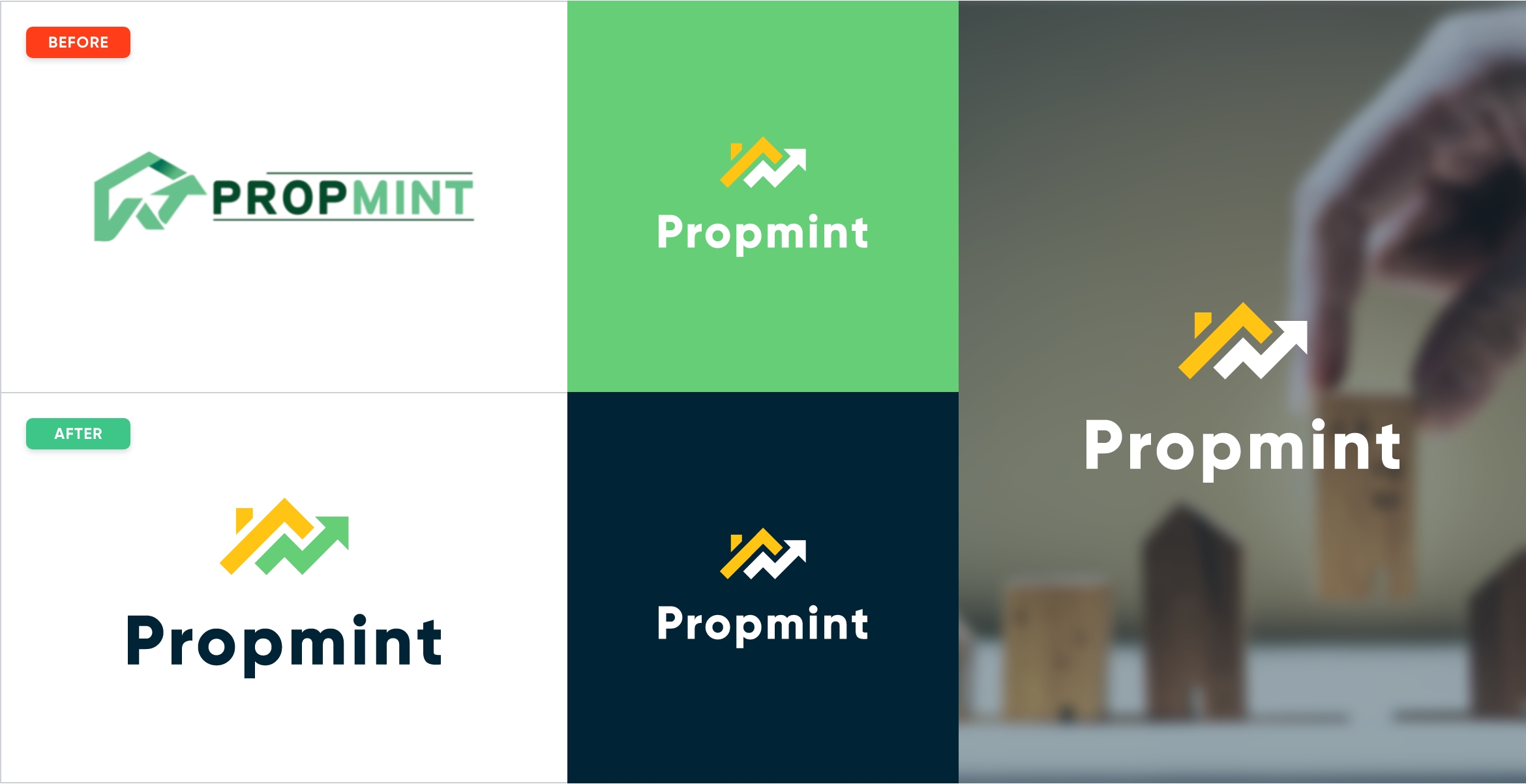
Propmint
Propmint is a property management system for landlords who have multiple properties. The client wanted to redesign their logo and the brand assets.I was asked to consider two main things while designing:
Use home or similar objects to show that project is about the property.
Also, the logo should show growth.

I chose a rooftop with a chimney to convey the message of the property.

I added an upward arrow to indicate the growth of the properties for the landlords.
I chose Emaral green, Lightning Yellow, and Daintree as the main colors of the company.
Emerald
Hex: 67CE78
Lightning Yellow
Hex: FFC414
Hex: FFC414
Hex: 002335
The final look