Usability testing for Medypass
Discovered how our innovative sharing features were affecting our users and made changes that resulted in a better user experience.
Overview
Project Timeline
May 2021 - Jul 2021
My role
UX researcher
UX designer
Visual designer
Context
Medypass app was developed during the pandemic in 2020 and released in a hurry because of the need for an opportunity to be able to share C19 records. I designed the MVP version based on the stakeholder requirements and brainstorming sessions with the team.
I was curious about the app’s usability, so in 2021 I organized a series of usability testings in order to find out how the app was affecting our users.
Within two months, I conducted 3 rounds of usability testing and discovered a number of issues that were acted on and we updated the app based on the feedback we received.
Problem
It was very difficult to get feedback from real users as the app did not have any active users for a while. We had to test the app with the people from our target audience.
Constraints
Limited budget
The budget for this project was very limited. I did not have the freedom to apply the costly methods and instead had to analyze free or cheap alternatives.
Distance
The app is developed for US citizens, I’m located in Uzbekistan so it was impossible to run Lab usability testing sessions. Instead, I relied on remote usability testing.
Busy schedule
I’m the only designer in the team and I have a lot of work with the other projects of the company. I had to plan and schedule the sessions with tight deadlines.
Target audience
James
Business consultant | United States
James runs a business consultancy agency in Ohio. He often travels between states to meet clients and does a couple of international travels a month. After the pandemic, he needs to carry C19 and vaccination passes all the time. A couple of times he could not get on board because he forgot his passes at home. He is tired of those papers and forgetting them.
Goals & Needs
Wants to keep all of his C19 and vaccine passes and related documents in one place, better if in an app.
He needs to show his records at the airports and other places where they are required.
He is tired of carrying records with him. It happened to him that he forgot some of the important records at home.
Emotions
Tired of carrying a lot of records with him.
Frustrated because he sometimes forgets important records at home.
Susan
Travek agent | United Arab Emirates
Susan is a very outgoing woman who works for a local travel agency. She usually visits restaurants with her friends and sometimes she has business lunches with her clients. Most of the good restaurants she likes ask for C19 or Vaccine status. There were cases she could not get into because she did not have her records with her. She hates carrying records with her.
Goals & Needs
She wants to keep her records with her in digital format.
She needs an app or something similar that can save her records and whenever needed she could bring it up.
She wants to keep her records in a secure place. She does not want to showcase her medical records to others.
Emotions
She hates carrying her medical records in paper format.
Frustrated because sometimes she is not let into her favorite restaurants without C19 or vaccine record proof.
Process
Plan
We planned the sessions with my UX manager.
Test
I ran the sessions with the people from our target audience.
Brainstorm
We disccussed the findings and decided what to update.
Design
I made the design changes to update the app.
Plan
We planned to run testing sessions with Uzbek people, in Tashkent. It was supposed to be a pilot session to get ready for the main testing with the actual target audience members. Besides, at that time we could not wait until we were to able test American users.
We decided that we test people from the 20-30 age group and I was supposed to find the participants. I approached a local company with the request, and they happily agreed to help as usability testing was something new for them and they wanted to see how it is run.
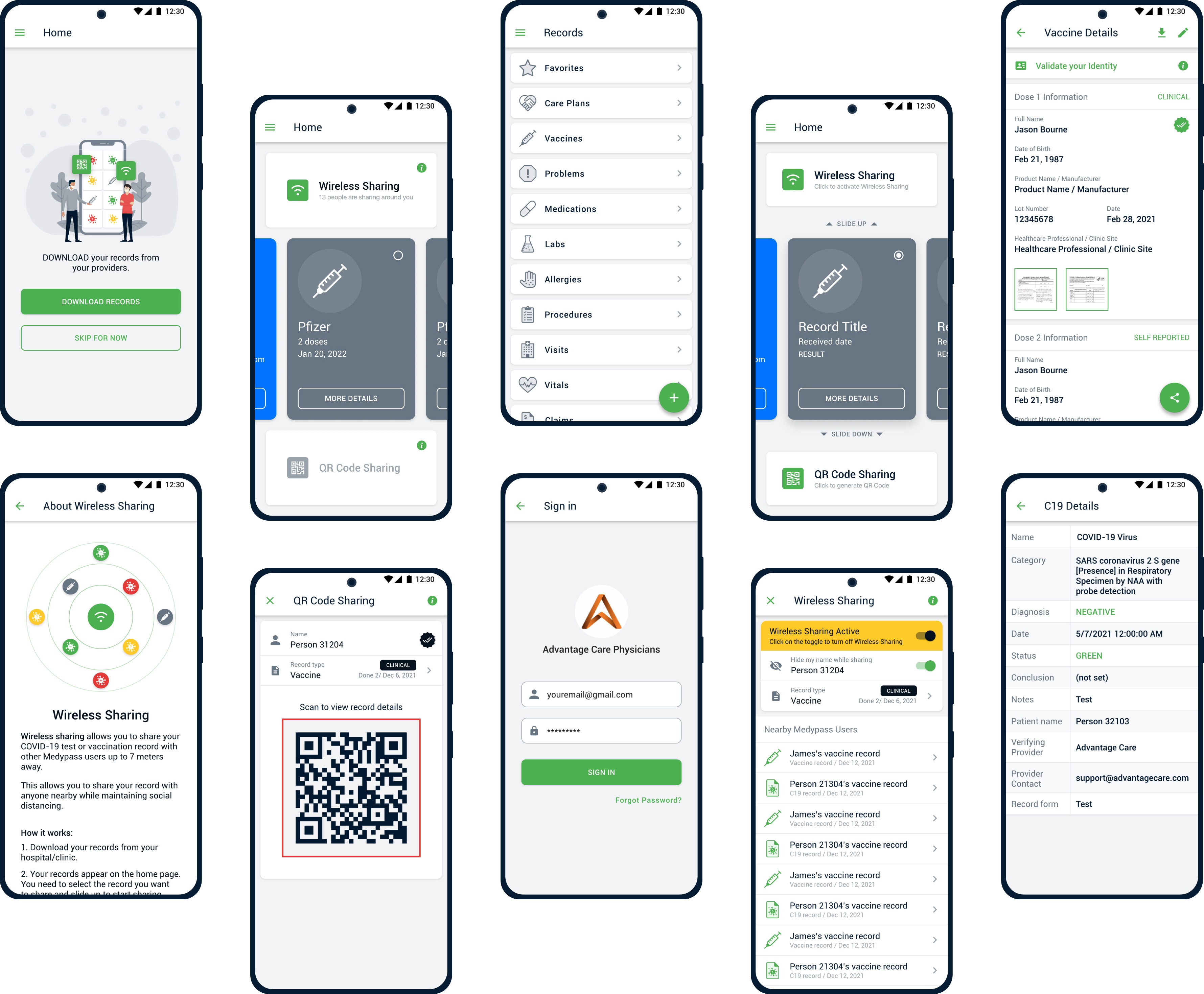
I decided to run the sessions in their office, our usability session turned into contextual testing which provided far better results than we expected. With the team, we decided to test the following sections of the app which were the most important areas:
Sign up and phone number verification
ID or Passport validation process
Connecting to providers to download patient records.
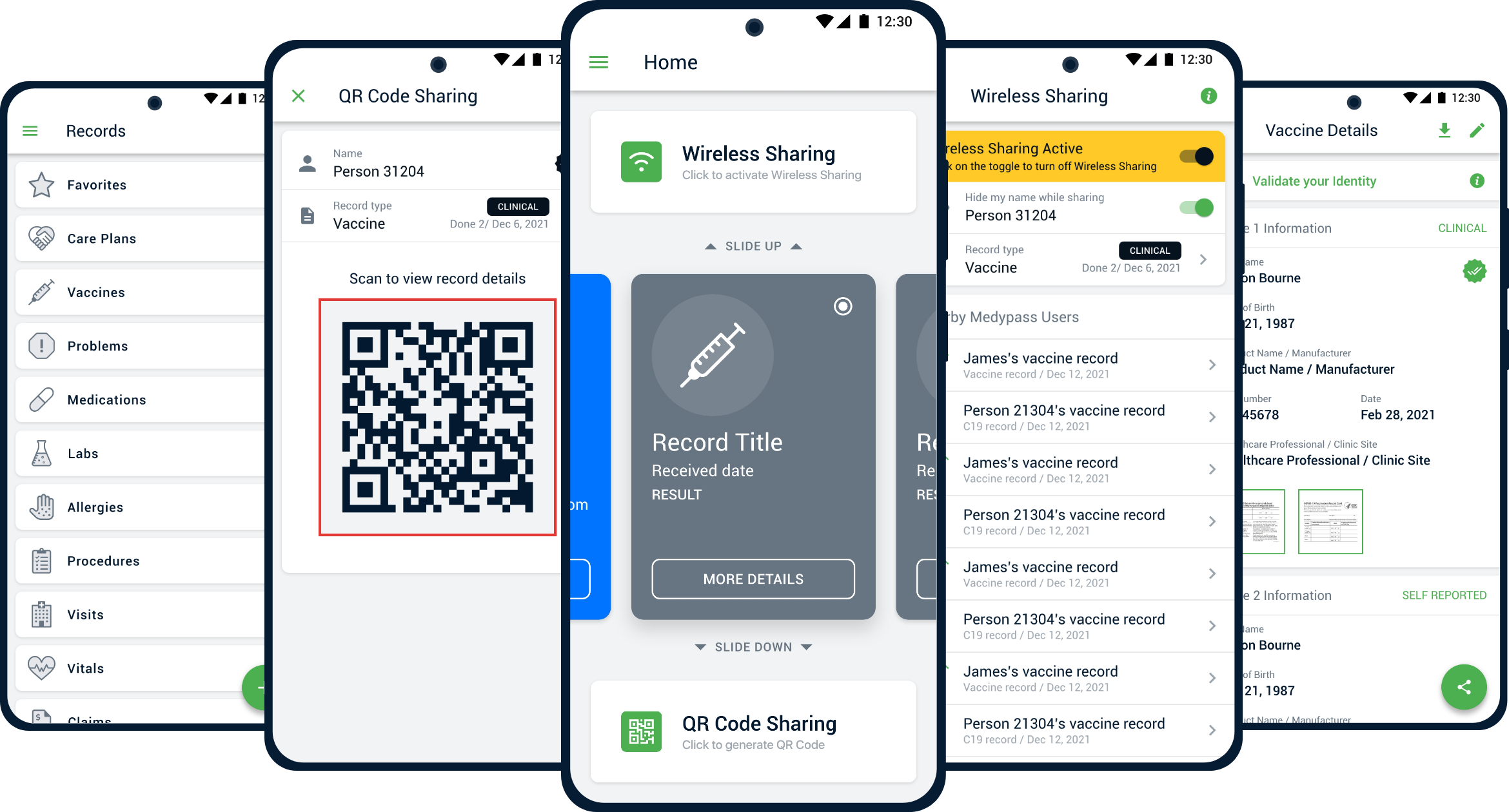
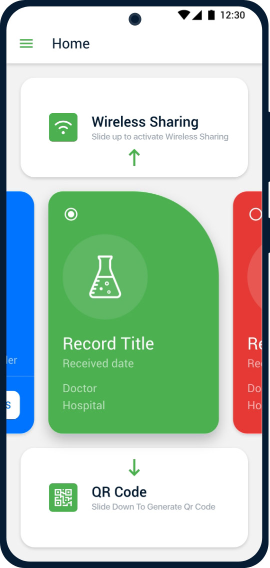
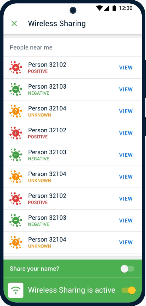
Wireless and QR code sharing features.
Find record details from the home page.
Test
I managed to conduct testing sessions with 4 users only. However, I discovered a lot of usability issues in the app. The main problems were related to Connecting to providers and with our Wireless sharing feature.
Connecting to providers
Wireless sharing feature
What I discovered
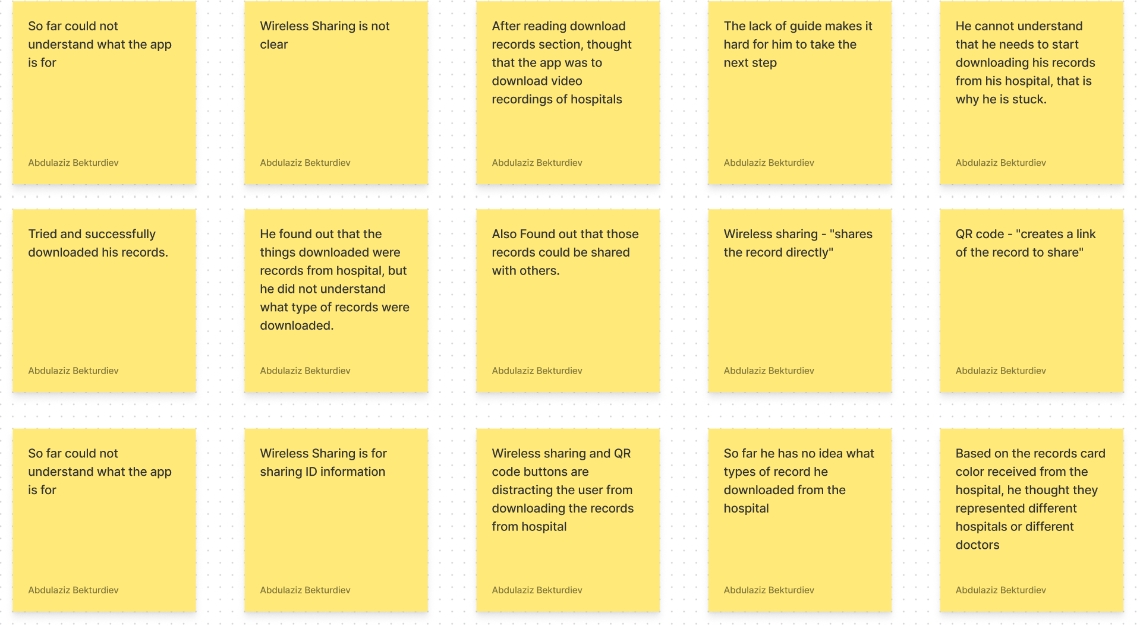
Connecting to providers is not clear
Users got confused on the home page where they were supposed to connect to their providers. Even though the CTA highlighted, they seemed to miss it anyway.
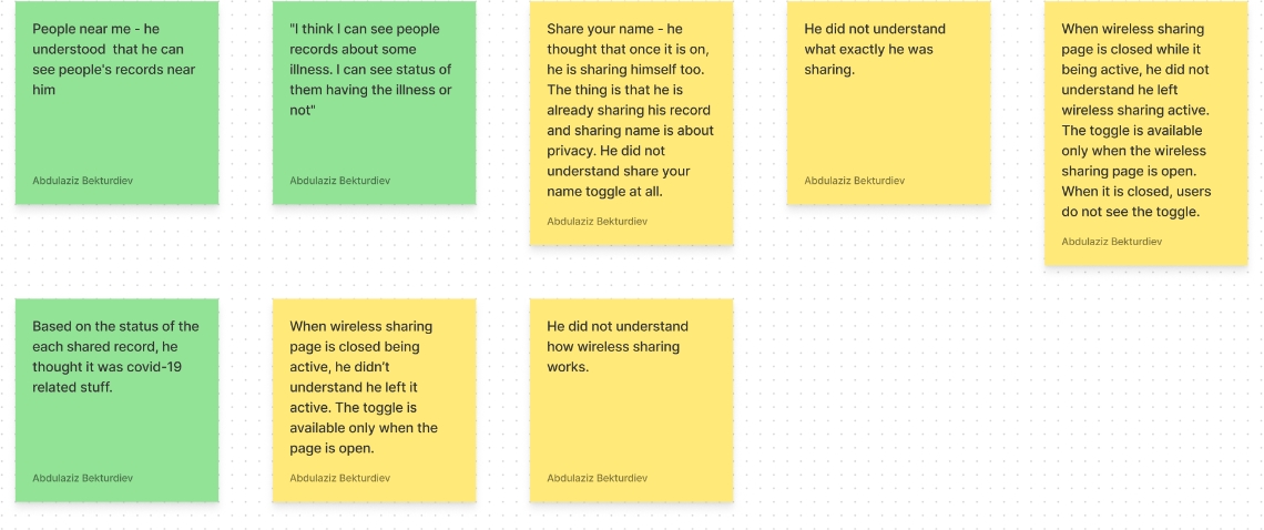
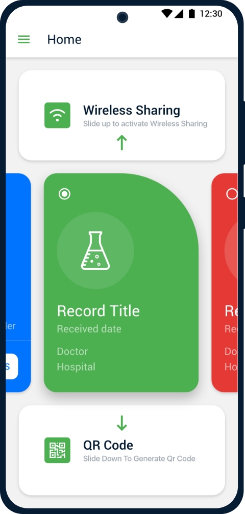
Wireless Sharing is not clear
Users seemed to not understand how the feature worked and why it was there. They kept asking about it and they could not find information to learn more about it.

Brainstorming
I shared my findings with my team. Based on the feedback I received, we brainstormed and came up with a number of solutions to the discovered issues.
Remove sharing features
We decided to remove sharing feature buttons from the home page in the starting point. We decided to keep only the download button.
Provide info about Wireless Sharing
We decided to add an info icon that leads users to the info page about the Wireless Sharing feature. This way users may find more about the feature if they desire it.
Design
Based on our brainstorming sessions with the team, the following changes were made to the design of the app:
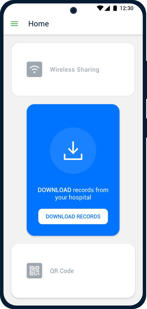
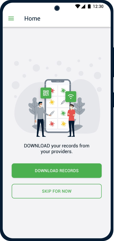
We removed the sharing buttons and concentrated only on the download records section. But we wanted to give choosing option to users, so we provided the skip for now button.
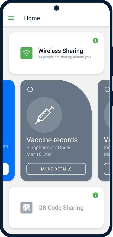
Here we added an info icon that leads to the info page about the sharing features that explain how it works. We discovered that Wireless Sharing features need explanation of how it works.
Additional changes
I ran two more sessions with users to find more issues. The sessions helped to identify more pain-points and based on the feedback I received from the users, we made changes to the app:
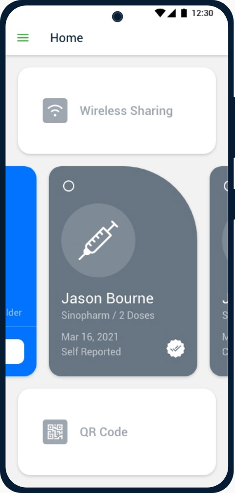
Card details not clear
The record cards on the home page are clickable. But it was not clear in the beginning, so we decided to put an info icon to help users. However, it did not help that much, so we decided to use a button instead of an icon.
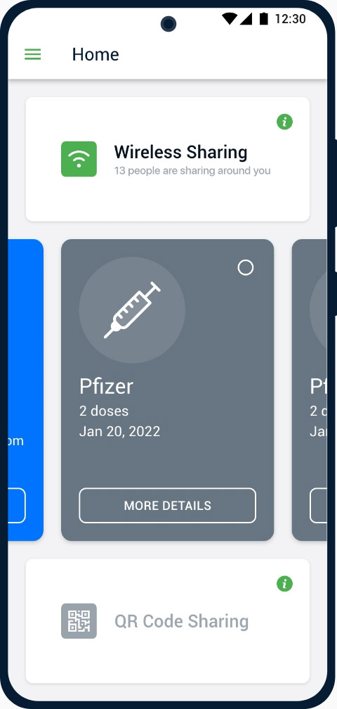
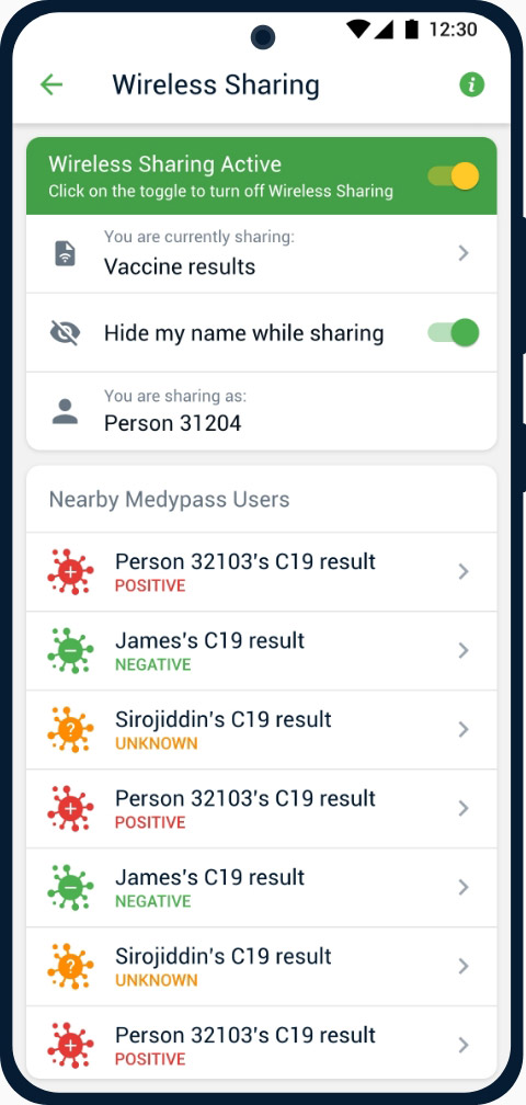
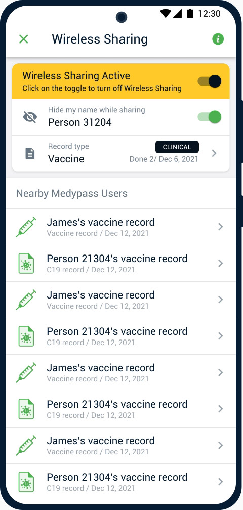
Wireless Sharing page
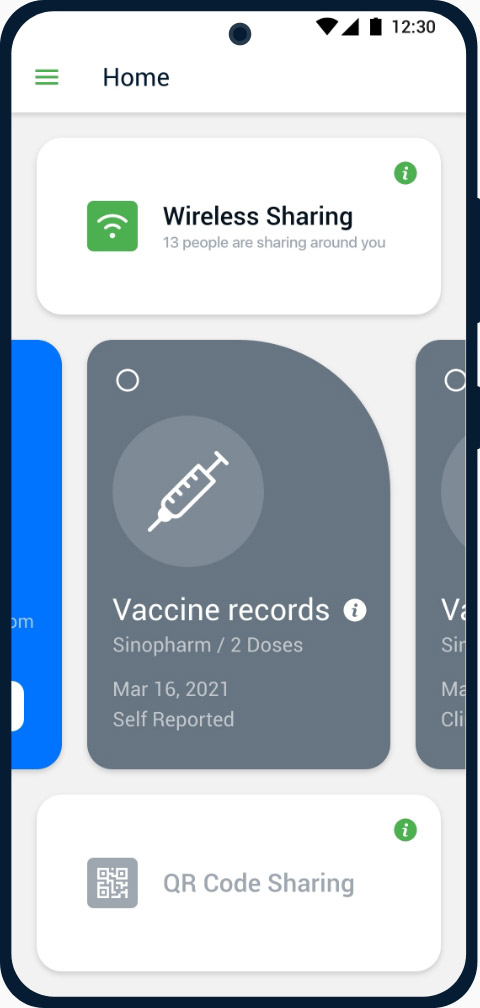
Based on the feedback we received from the second session, we made the changes to this page (middle image). But it did not provide expected results. So we improved the page further and ended with a better option (3rd image).
The final look
What I learned from this experience:
Any usability testing has value
I understood the term “Doing some usability testing is a lot better than not doing testing at all”. The first usability testing helped us to discover 2 big usability issues.
Planning helps
It was a lot easier for me to stick to the plan we made with my UX manager during the testing. The plan helped me to concentrate on the main tasks.
Rational thinking is important
In the last session, participants provided a lot of positive feedback. We had to be very careful with that because they were used to providing positive feedback as those participants were from the User Testing board.
No to extra feature desires
It has been very hard to stay away from extra feature desires. After the usability testing, we could rely on real user data to be able to concentrate on the main goals of the app and improve its usability.
Other Projects
Wing Customer app redesign
Strived to find the best solution that helps Wing enhance the usability of its delivery management system, based on the new business model.
CASE STUDYJowi Owner app design
Designed an app that helps restaurant owners manage their businesses in a very efficient way.
CASE STUDY