Medyear Pro web system redesign
Redesigned the web system for healthcare professionals to make the interaction with their patients easy, simple, and more effective.
Overview
Project Timeline
May 2020 - Aug 2020
My role
UX designer
Visual designer
Context
Medyear Pro is a web based system that helps healthcare professionals manage digital interactions between them and their patients. The system has been in the market for more than 4 years and was struggling to meet its end users because of ongoing updates.
I redesigned the Medyear brand and its assets, so Medyear Pro was required to be updated based on the new brand guidelines. However, aftar through analyses of the system and its structre we decided to update the whole system, not just the look.
I redesigned the system structure and the layout while working closely iwth UX manager, the co-founder, engeneering manager and the developers.
Problem
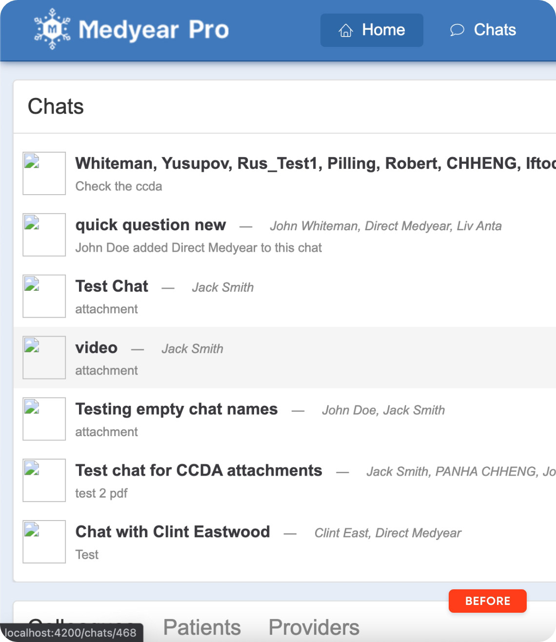
The system navigation was designed to handle 3-4 main sections. We could not add new sections to the navigation because there was not enough space. If we tried to add new sections under the current ones as subsections, we would cause confusion that would result in very bad usability.
Constraints
Limited research
I could not run proper UX techniques such as user interviews, usability testing and etc. to get insights about the system. I had to rely on stakeholder interviews only.
Hard to empathize
It was hard to really understand how healthcare professionals could use the system in their context. I tried to observe my day while working as he is a doctor.
Hard to concentrate
I became a dad while working on the project. It was my first baby, so it was really hard concentrate on the work working remotely with a newbord baby around.
Target audience
Dr. Jason Brown
Clinical Immunology | United States
Dr. Jason is a clinical immunology in Queens hospital, NY. He has a lot of patients who approach him with questions related to Allergies. Talking to people over phone is what he hates the most. He gets lots of calls during the day. He cannot give prescriptions over the phone and he cannot totally understand the situation if he doesn’t see the patient.
Goals & Needs
Wants to be able to chat with patients through some kind of trusted digital messanger, or system.
He needs to get visual proof of patient’s conditions. Just sending images through whatsapp does not work.
Wants to be able to provide prescriptions digitally if the situation requires that.
Emotions
Tired of talking to the patient’s over the phone.
Upset becase people keep asking him for prescriptions over the phone which he does not want to do.
Dr. Samantha Aniston
Physician | United States
Dr. Samantha is physician in the local hospital. She interacts with lots of patients daily. She needs to see patient’s medical history to be able to diagnose things properly and also be aware of past medical isssues. She gets the hisotry in paper format most of the time. There were several times when she lost the papers in the office.
Goals & Needs
Wants to be able to exchange document digitally.
She needs to get access to the medical history of her patients whenever she needs.
SWants to have an opportunity to share the documents with her coworker to get their suggestions.
Emotions
Upset to lose medical history documents of the patients.
Tired of waiting for the documents to be provided if a patient is coming from other hospitals.
Process
Research
I ran stakeholder interviews with the team leaders.
Brainstorm
I brainstormed to come up with the best solutions.
Design
I designed a high-fi mockup with prototype.
Test
We tested the system design with healthcare professionaals.
Research
During the discussions about the system, I tried to find as much details as possible. Those details would help me while designing the new update. We decided to do the following:
We will update the system based on the new company guidelines.
I need to come up with new navigation system that is simple and easy to understand.
The system will be developed for web devices only, no need to make it responsive.
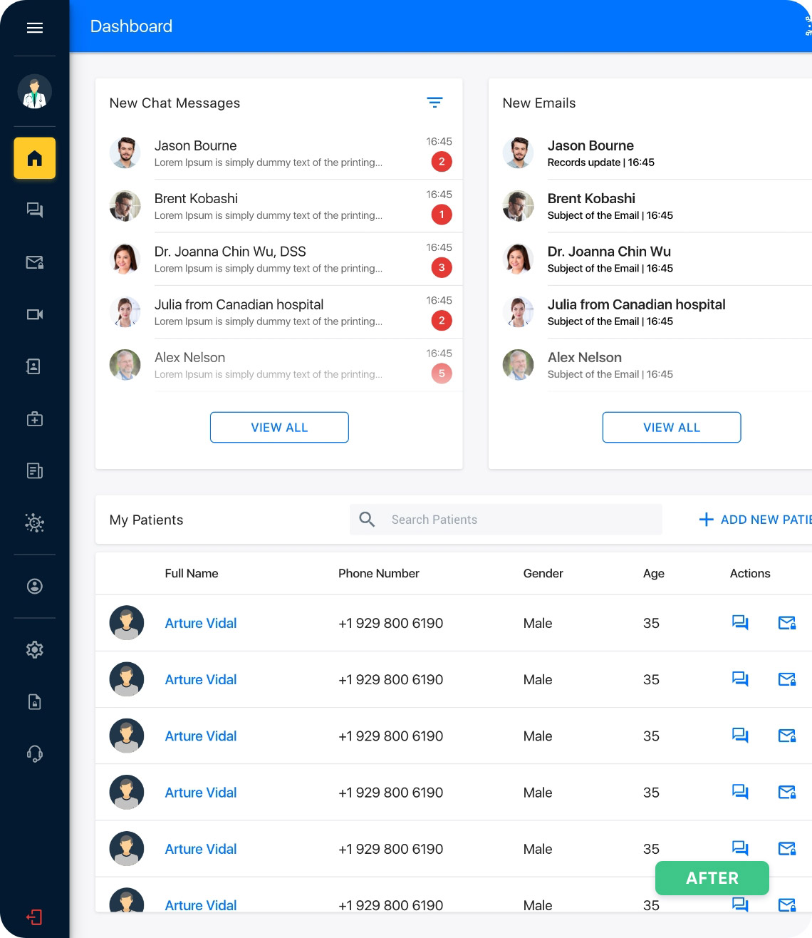
The home section should be a dashboard that shows multiple type of information.
New sections could be added in future so new navigation should be able to easily handle that.
The layout should be simple so that healthcare professionals can get used to it very fast.
The system should provide different languages and it should be in a visible area.
Brainstorming & Design
Once I received the requirements, I started working on the project. I was busy with other tasks as well, besides I had extra pressure to finish this project sooner. I had to gor for hi-fi prototype directly which was very risky. I had to make decisions on the go and apply them to the end-looking design directly.
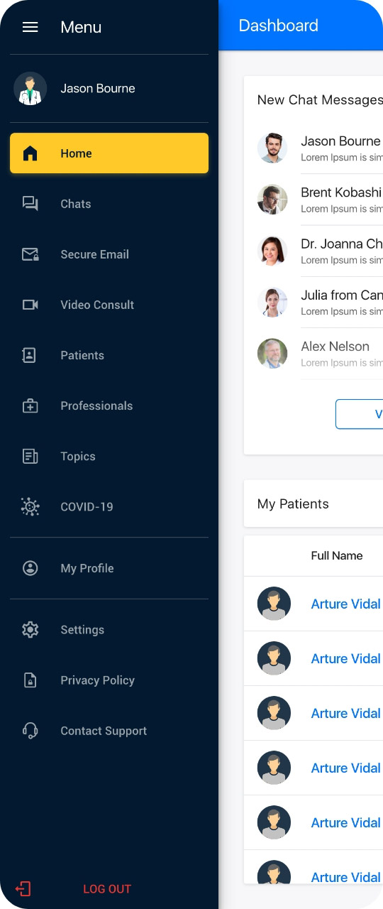
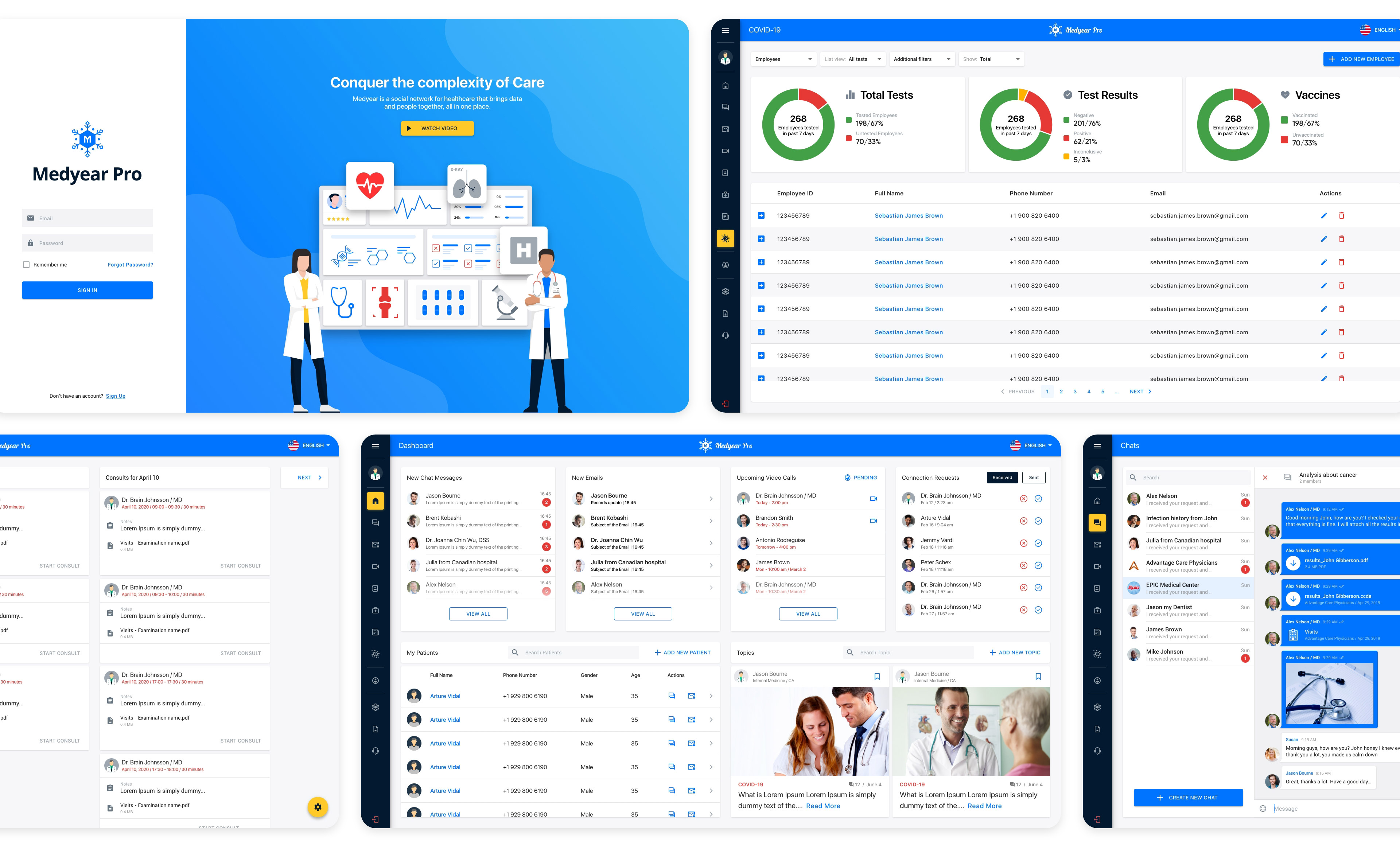
Navigation
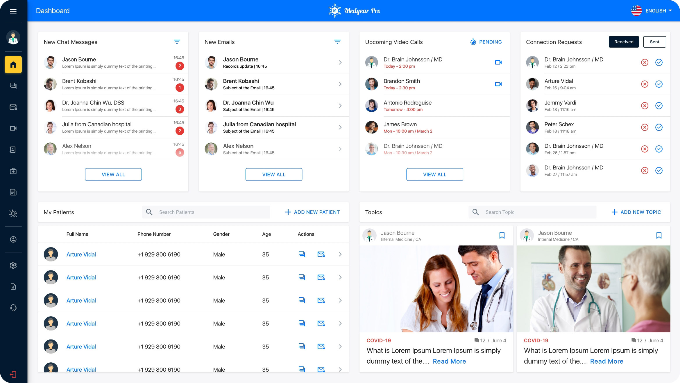
In order to make the main navigation visible and to be able manage the increasing number of sections I decided to use sidebar navigation. It is collapsable that helps healthcare professionals concentrate on the content when it is needed.
Grid layout
Even though the system is dedicated for web devices only, I wanted to address different sizes of those devices. From small laptop screen to huge displays. I believed that the option would be to use grid layout that can adjust to the size of the device.
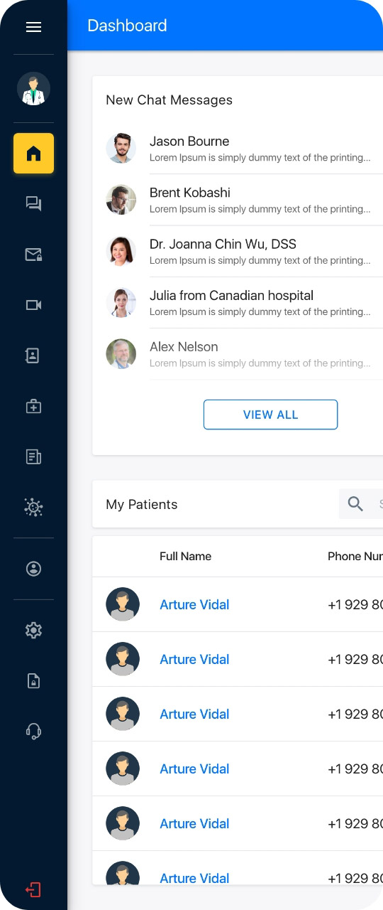
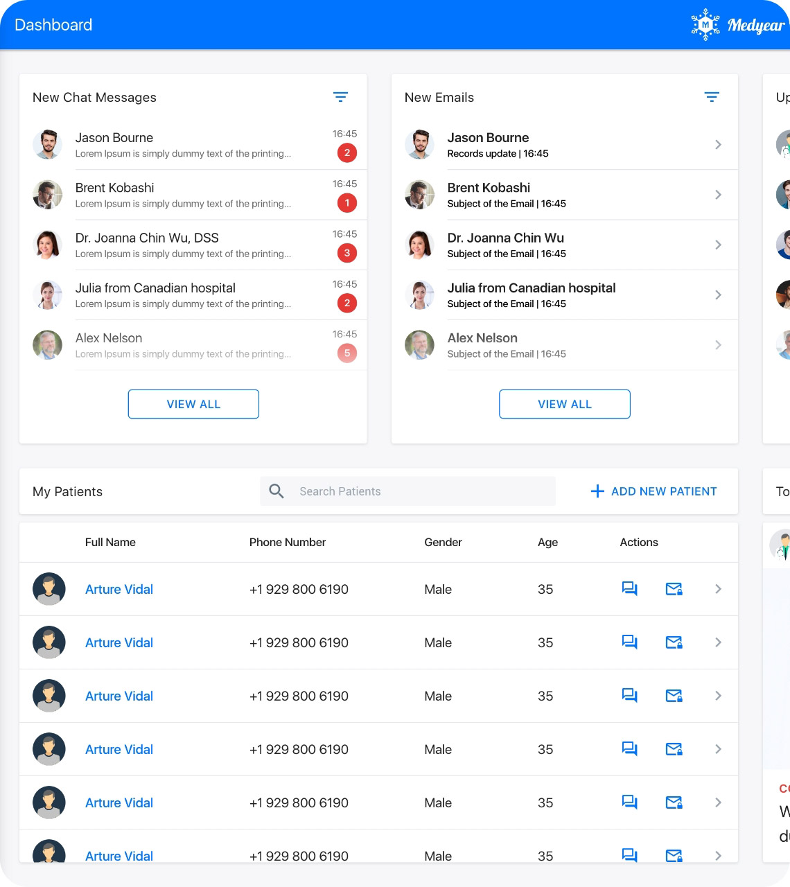
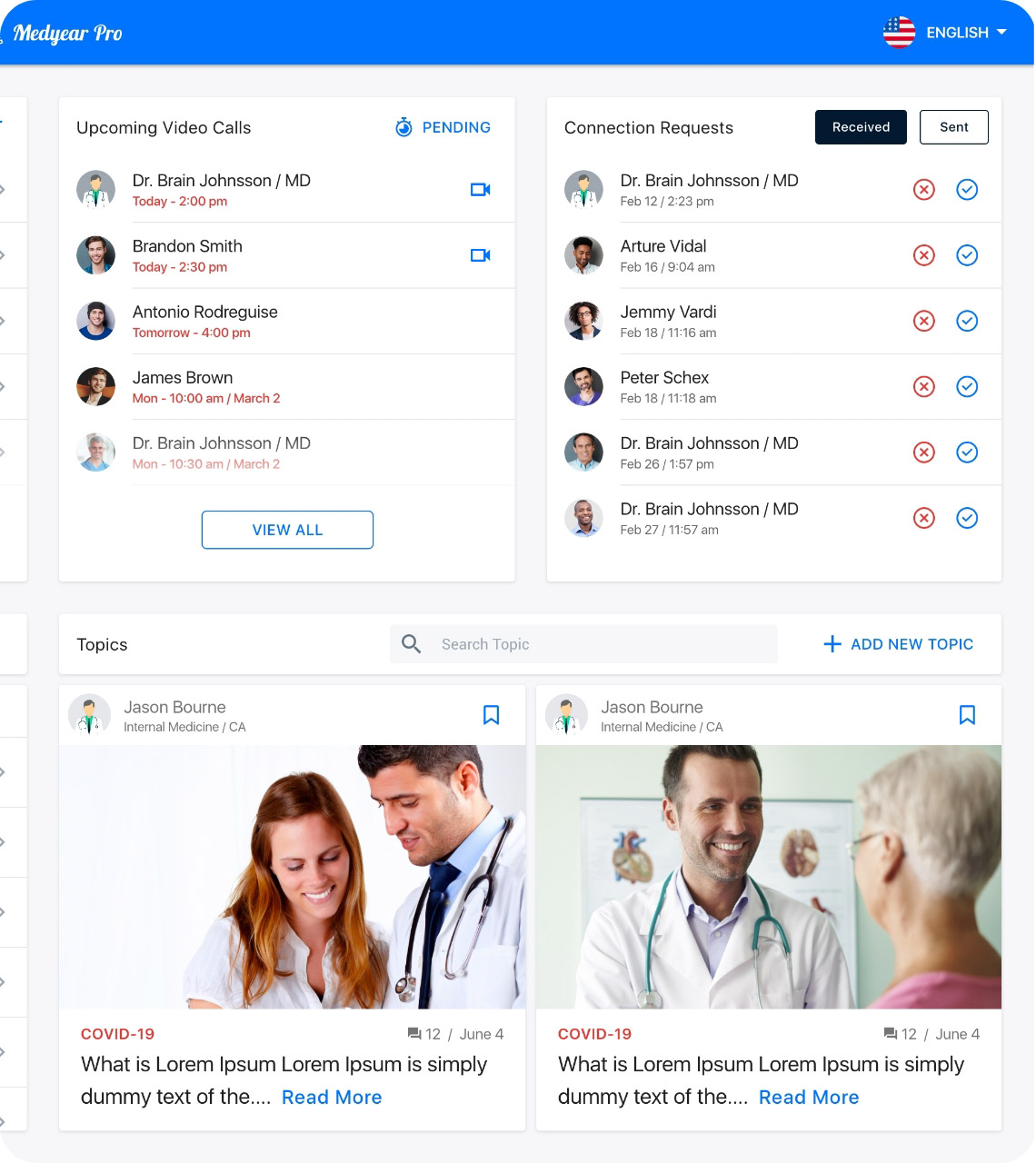
Dashboard
The dashboard shows preview information of chats, new emails, upcoming video calls, connection requests, patients list and the popular topics posted by other healthcare professionals. Each card has a button that leads to the particular section.
Grid layout
I decided to occupy the right top corner for language optoins. It is very easy to navigate and visible all the time that helps healthcare professionals to switch between different languages is required.
Components
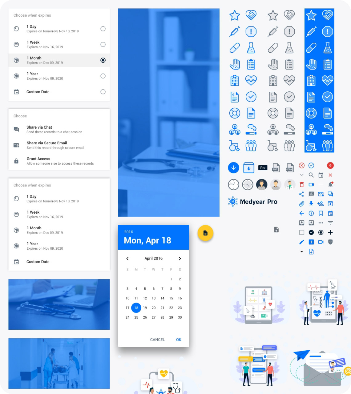
I tried to use generalised component library in project to avoid a lot of extra work in future. This decision helped me a lot while designed the patient side of the system.
Test
I could not run a proper usability testing with the ends, but we managed to get feedback from two healthcare professionals. Overall impression was good but there were things to improve.
I had to share the designs with the team constantly to get feedback and fix issues on the go. It took longer to finish the project, but it compensated the rist I took by desining everything on the go. I was asked by the team to improve the design in these areas:
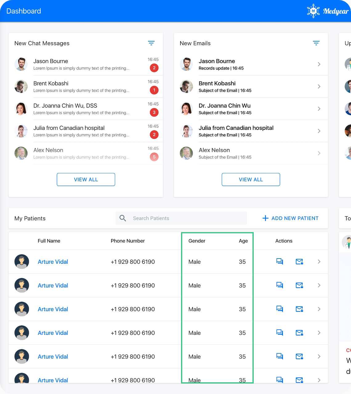
Patient details
A doctor named Paul Fu stated that it would be better if he could see patient gender and age in the patient table on the dashboard. We listened to him and updated the table with requested information piece.
No filter button, add View All button
I was requested to remove Filter icon from the cards as there won’t that feature. Also I was asked to add a “View All” button instead of just cliking on the card.
The system is being updated constantly with new features, removing unnecesssary elements or sections and etc.
The final look
What I learned from this experience:
Research is necessary
I had a very hard time without a proper research. It would make my job a lot easier if I had data from healthcare professionals directly.
Components library
The library of components I designed for this project saved me days of work during the design process of the patient side of the system.
Observing my doctor dad
Observing my dad during his work, helped me to understand the work life of healthcare professionals. I designed the system based on the knowledge I collected from those observation sesssions.
Usability testing is important
I cannot state that the system is very good from UX prespective unless I can test it with healthcare professionals. I would love to test it with my dad at least, but he does not speak English.
Other Projects
Usability testing for Medypass
Discovered how our innovative sharing features were affecting our users and made changes that resulted in a better user experience.
CASE STUDYWing driver app redesign
Reimagined how drivers perform deliveries with a different approach that contributed to a rise in efficiency and a drop in delivery time.
CASE STUDY